

MHacks Design Suite
Central idea
Give Michigan's hackathon one visual language, flowers rendered through technology, that carried from the first poster to the final check.
- Role
- Design Chair
- Duration
- 9 months
- Feb to Oct 2026
- Scope
- Brand identity
- Website
- Interactive games
- Print and merch
- Toolkit
- Figma
- Photoshop
- Next.js
- Claude Code
One visual language, from the first poster to the final check
MHacks is the University of Michigan's hackathon. For the 2026 edition on October 3 and 4, I was the design chair on a team of four, and we built the brand from February all the way to the event itself. The scope kept growing as we got ahead of schedule, so the suite ended up covering a website, two mini games, a digital check-in pass, social posters, a printed banner, the stage deck, the hacker t-shirt and a giant prize check.
I built the website on my own, and coded the boarding pass and bouquet builder with Claude Code before handing them to engineers. They connected the backend and databases, but left the frontend almost exactly as I designed it.
- Applications
- ~2,000
- Accepted and RSVPed
- 800
- Hackers on site
- ~600
- T-shirts printed
- 900
Michigan's flora, seen through the eyes of technology
We explored a few directions early on, from Bauhaus geometry to pattern-making and puzzles to soft gradients and flowers. The one we chose mixes technology with Michigan's flora. The apple blossom, Michigan's state flower, became the anchor because it tied most directly to the university. The tech side comes through ASCII and pixel art, so every flower looks like it's being rendered by a machine.
Four designers stayed consistent by agreeing on why before what
The hardest part was keeping one brand across web, print, fabric, stage and social, with four designers at different levels. A strong reason for the theme mattered more than any rule. So the first thing we did was narrow the theme down and build a small asset library of the visuals we would use. We agreed that ASCII and flowers were our main visual language. I recommended tools like ArtKit CC to the team, and we only used photos from Michigan Commons, the university's royalty-free media library. After that, consistency came from giving feedback back and forth on every piece.
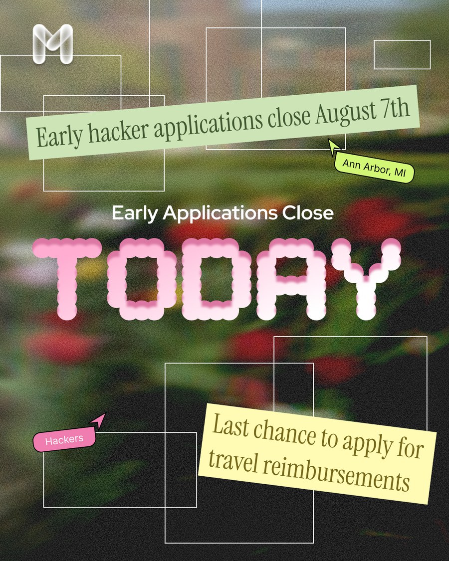
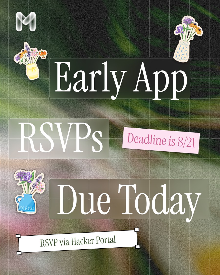
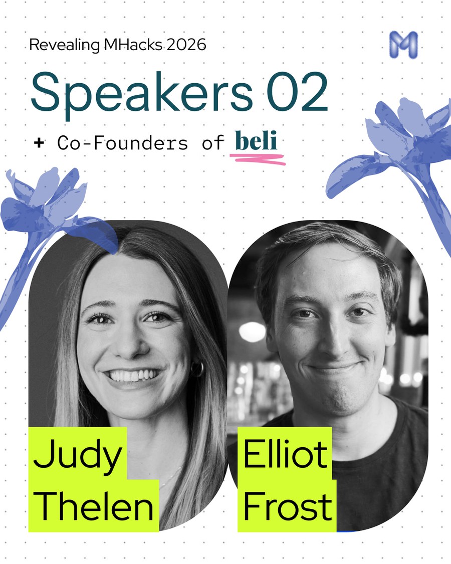
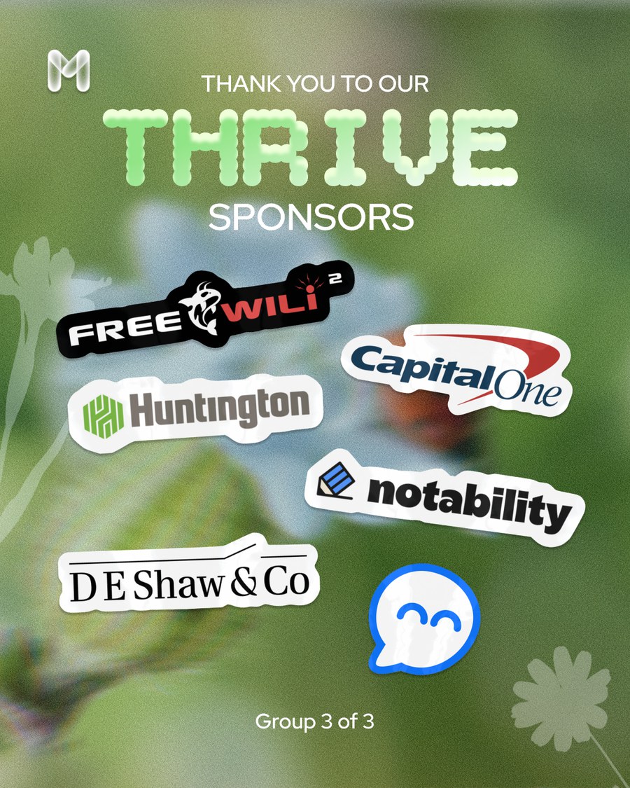
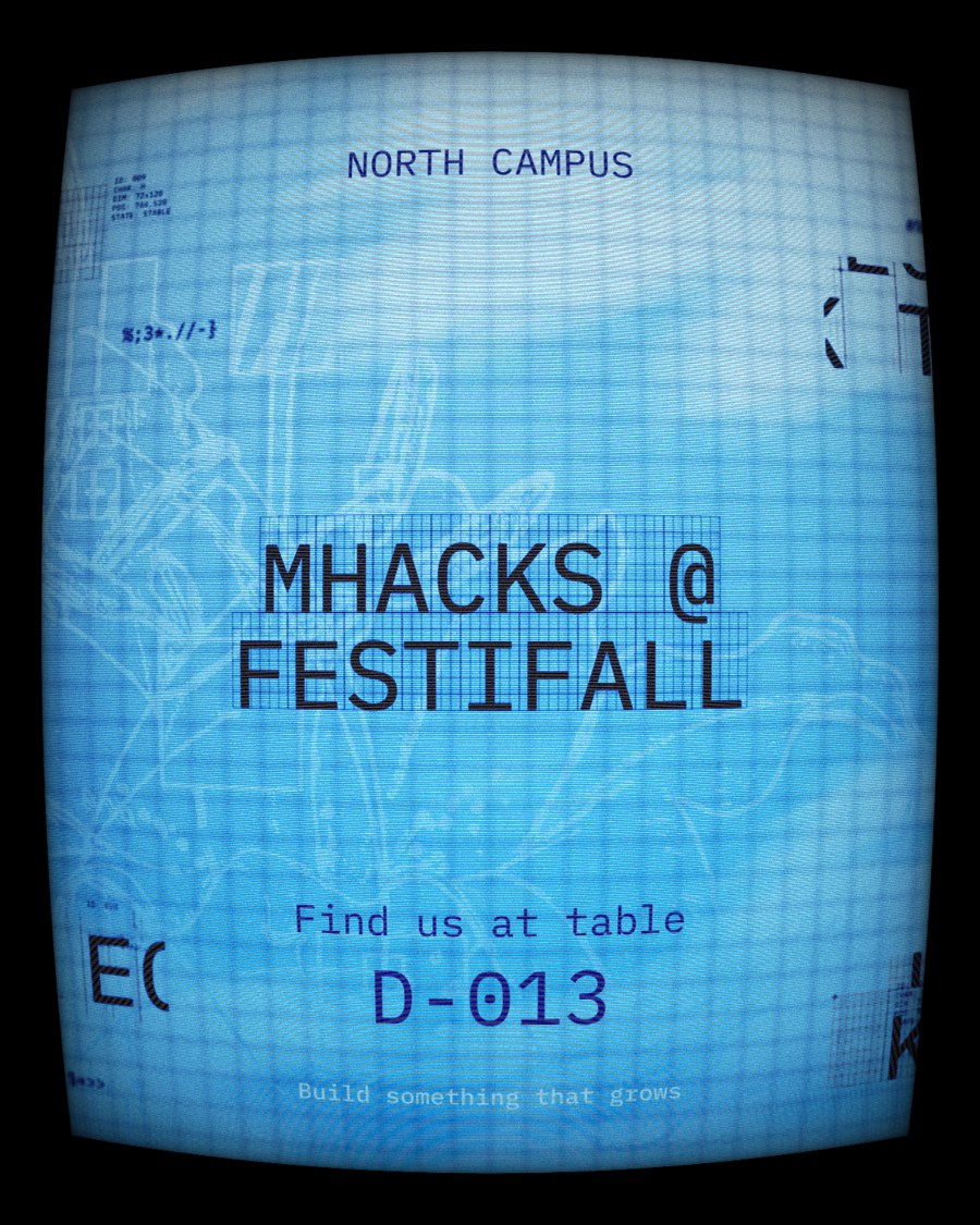
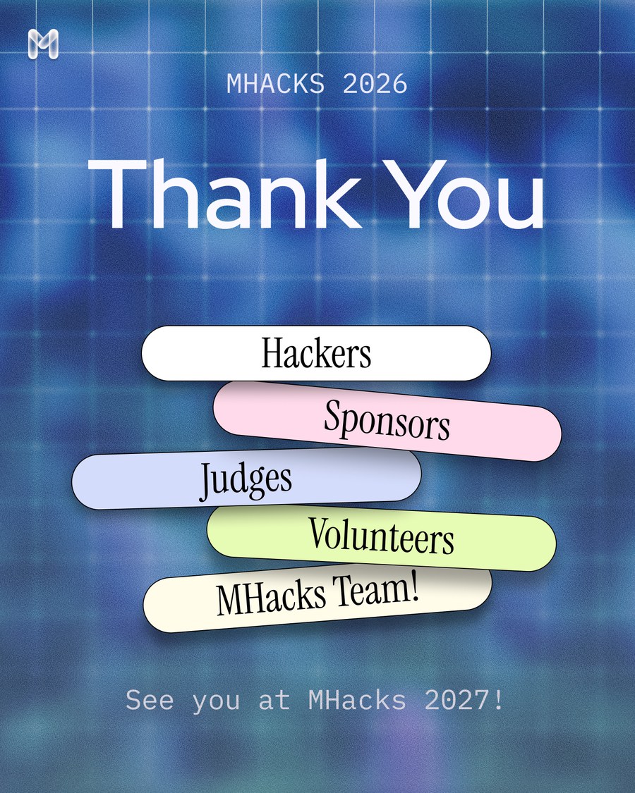
Social posters were where that showed most. I designed many of them. Each series had its own job, from countdowns in pixel type to speaker reveals and sponsor thank-yous, but they all drew on the same blossoms, grids, screen textures and paper labels.
The website hides the garden behind an ASCII lens
I designed and built mhacks.org myself. The hero is a blurred photo of a garden. Moving your cursor drags a small lens across it that reveals the scene as a grid of ASCII dots, like looking at nature through a machine. Below the hero, sections stack and slide over each other as you scroll.
Two mini games gave every hacker something of their own
A boarding pass to share once you're in
Both games were for marketing. Accepted hackers could make their own virtual boarding pass, with their name, departure city, backdrop, typeface and a bouquet sticker, then download it to post on social media. Every share announced MHacks to their followers.
A bouquet that ends up on the big screen
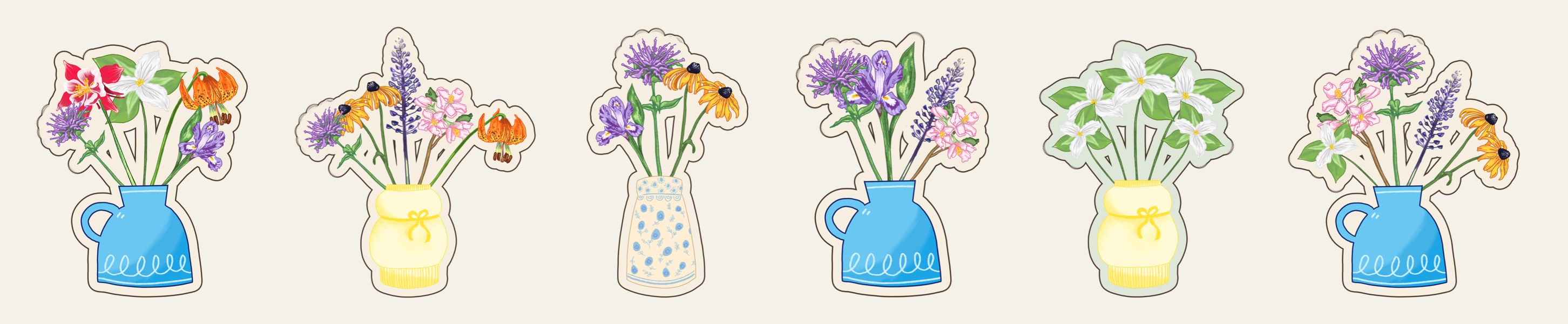
The bouquet builder lets anyone arrange Michigan wildflowers in a vase and keep it as a die-cut sticker. My teammate drew the flowers and vases, and I turned them into a working experience. During the hackathon, people's bouquets decorated the slide deck and the live site, which gave the event a small personal touch.
On the day, the brand was on everything hackers touched
A pass for check-in and every meal
Every hacker carried a branded Apple Wallet pass. It got them through check-in and was scanned again for food throughout the weekend.
 MHacksOct 39:00 AM

900 t-shirts
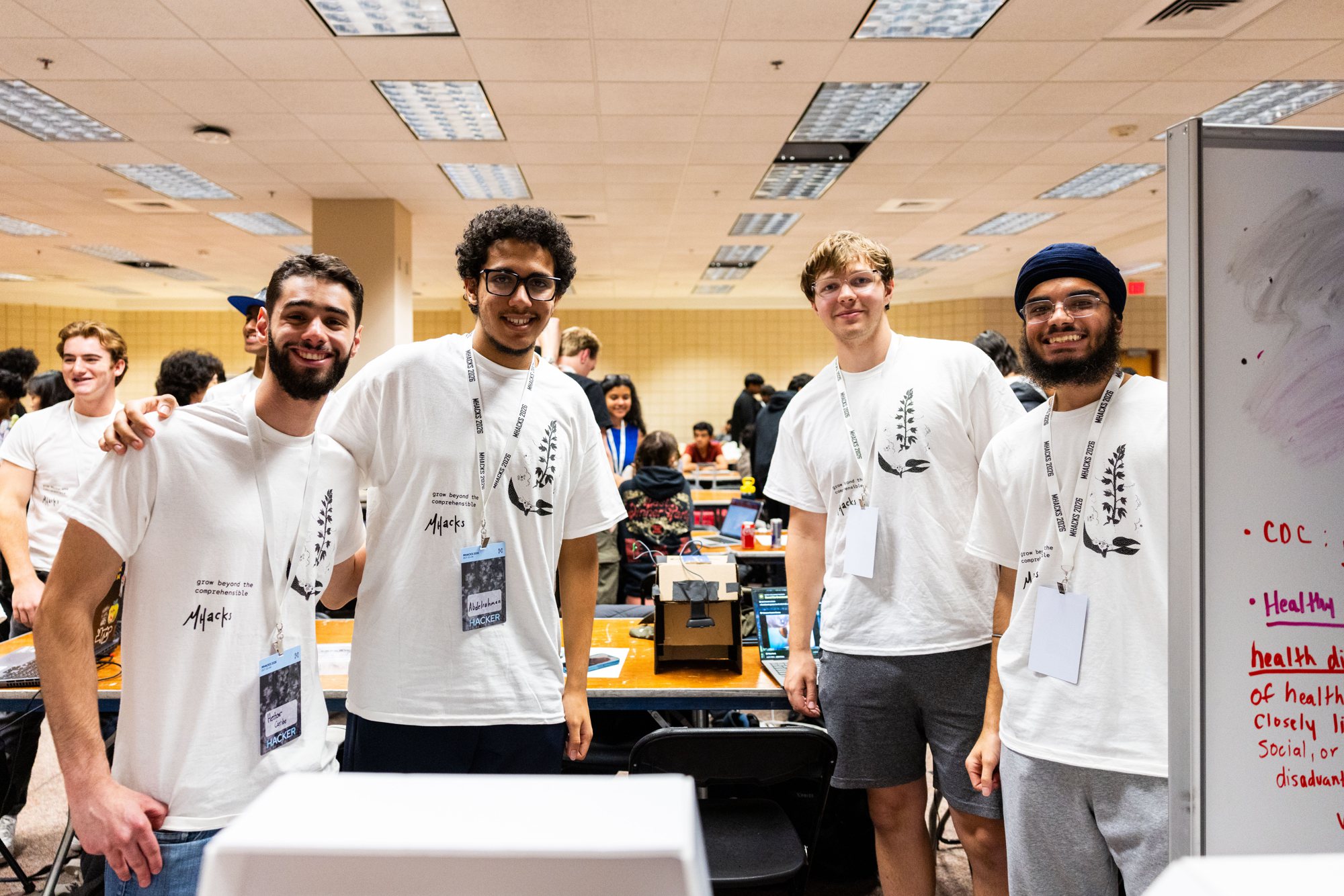
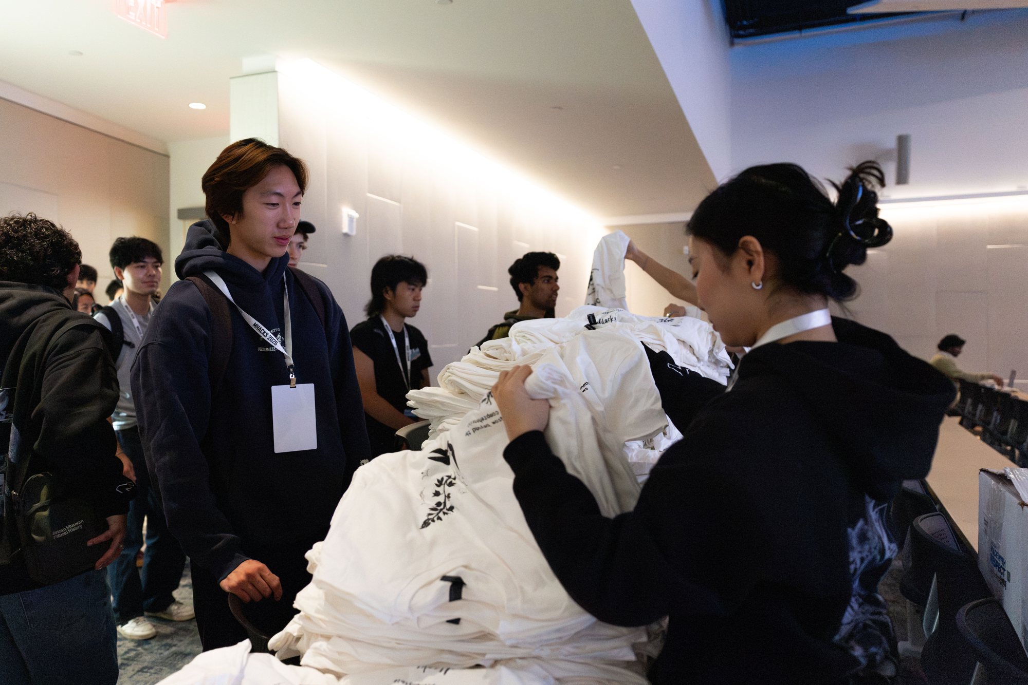
I designed the hacker t-shirt: a dithered plant next to the line “grow beyond the comprehensible” and a hand-drawn MHacks wordmark. We printed around 900 of them, and I handed many out myself.
A stage deck and a check worth a photo
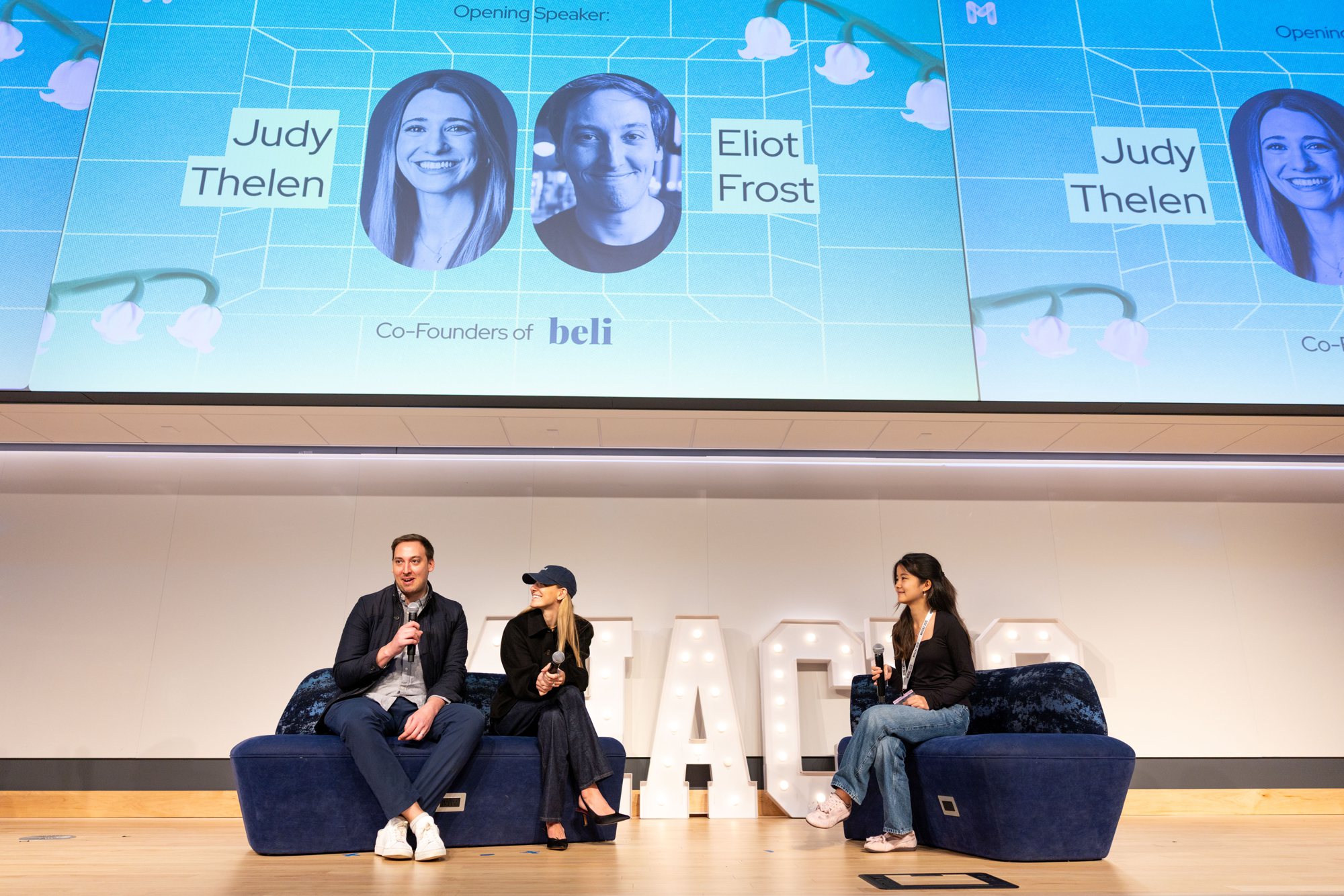
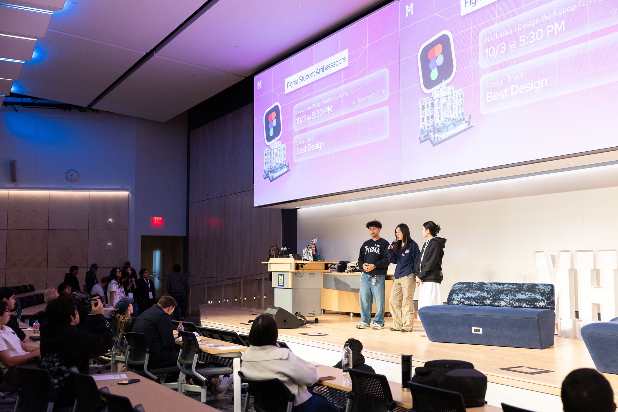
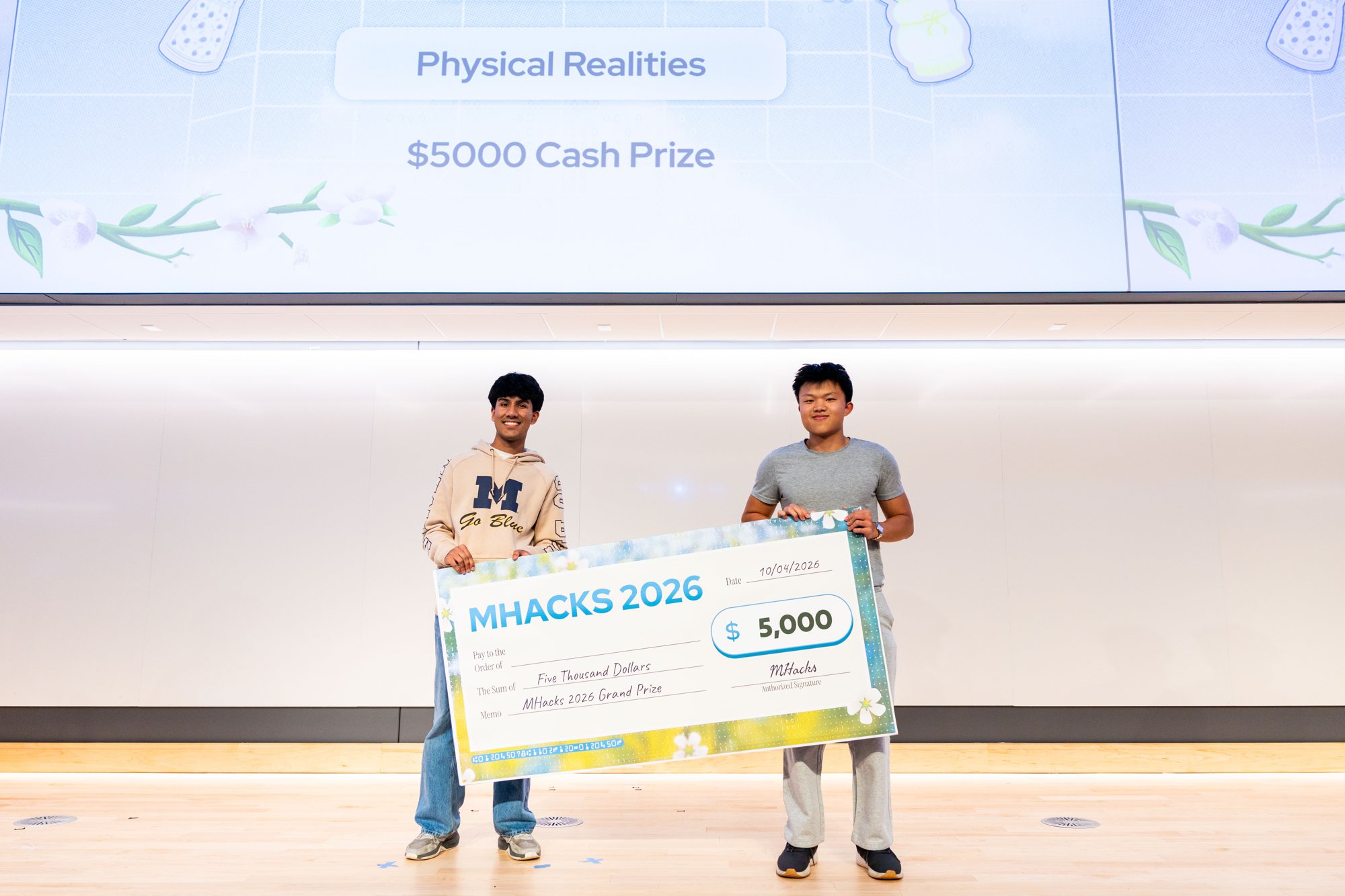
I designed the slide deck for the event, from the opening speakers to the prize announcements. For the winners, a teammate designed the check and I gave feedback. Then I glued the prints onto foam boards, so each check came out 40 by 80 inches: big enough to feel like a moment on stage and in every photo afterwards.
Consistency comes from a shared reason, not a rulebook
Agree on why before you design anything. With four designers at different levels, the asset library and the shared idea of tech meeting Michigan flora did more for consistency than any checklist could. It let people make their own calls and still land in the same world.
Designing in code shortens the handoff. Because I built the website and games myself, engineers only had to connect the backend. What hackers used was what I designed.
A brand gets stronger when people can make it their own. The boarding passes and bouquets turned hackers into contributors, and their work ended up on social media, on the slides and on the live site.
Event photos by Soyeon Kim.