
Loop Client Onboarding
Central idea
Bring clarity and trust to opening a fintech account through a redesigned flow and a UX refresh.
- Role
- Sole Product Designer
- Duration
- 8 weeks
- Summer 2026
- Scope
- End-to-end flow
- Conditional logic
- UX copy
- Prototyping
- Toolkit
- Claude Code
- Figma
- MCP
- Vercel
Opening a business account takes more than a form
Loop is a Series A fintech that builds finance tools for Canadian small and medium-sized businesses: corporate cards, low FX rates, global accounts and expense management.
Before a business can use any of that, it has to apply. Someone from the business fills in its details, its legal and ownership structure, tax ID, industry, what it sells, and its yearly revenue and spend. Then every key person (owners, directors, signing officers) verifies their identity. Loop's risk team runs a background check and a KYB/KYC review, and only after approval can the business open an account and apply for a credit limit.
I was the only designer on the project, working with a product manager and three engineers over eight weeks. I also met often with the chief compliance officer, the risk team and customer service to find out where people were getting stuck. My job was to redesign the whole flow: the layout, the copy, and the logic of which questions get asked and when.
- Time to apply, in testing
- 23 → 9 min
- From audit to approved design
- 8 weeks
- Prototype versions
- 14
One long form for every kind of business
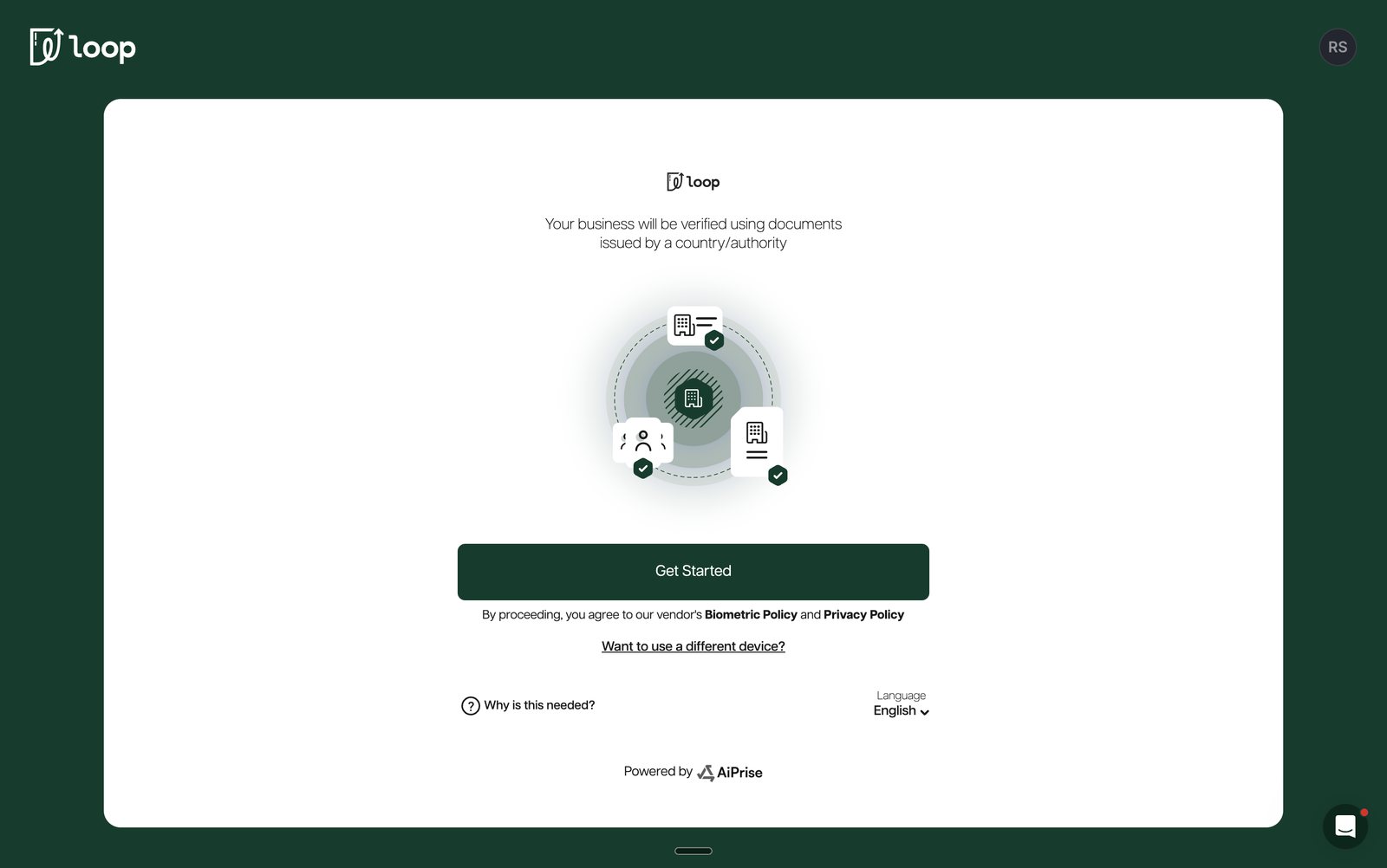
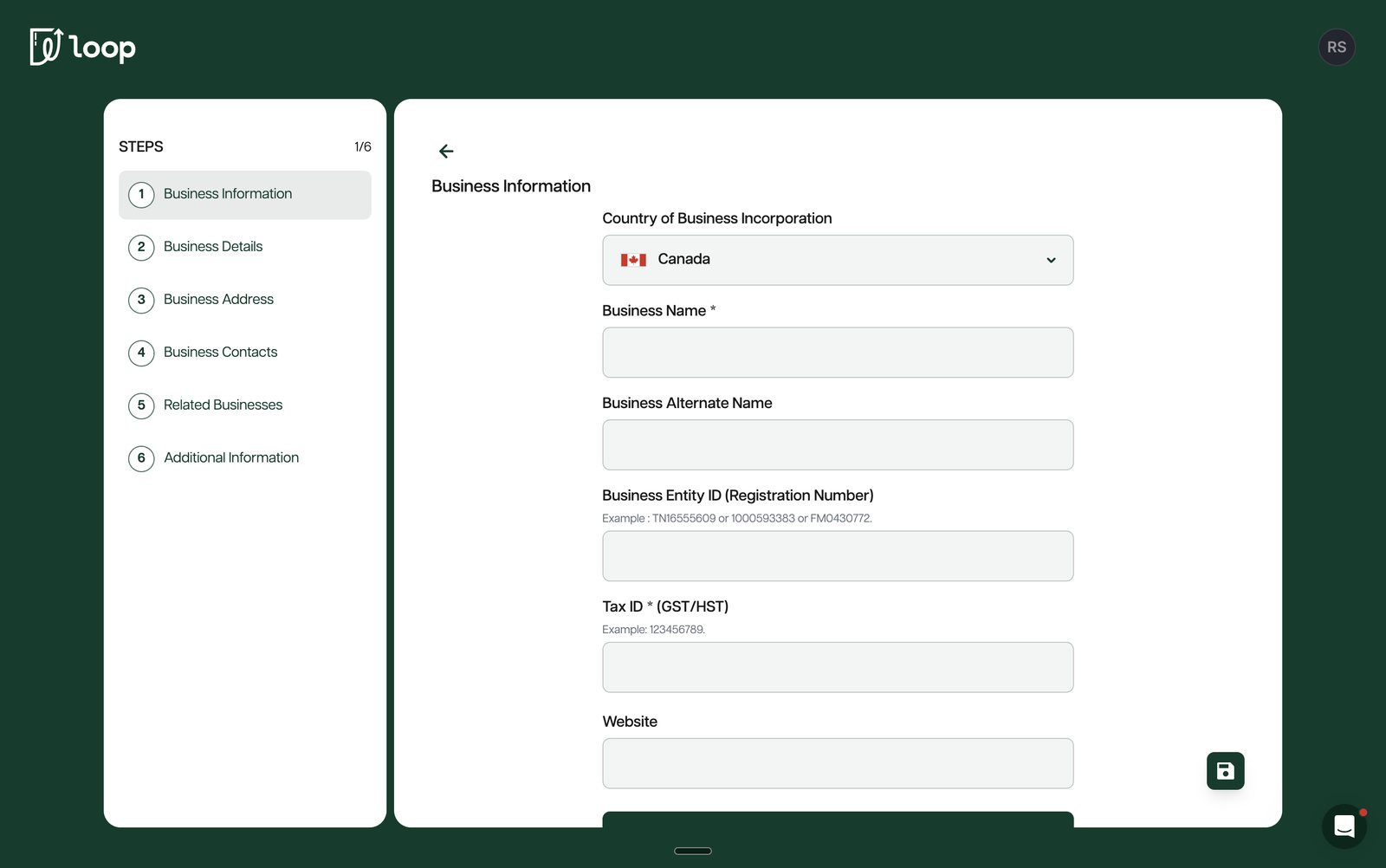
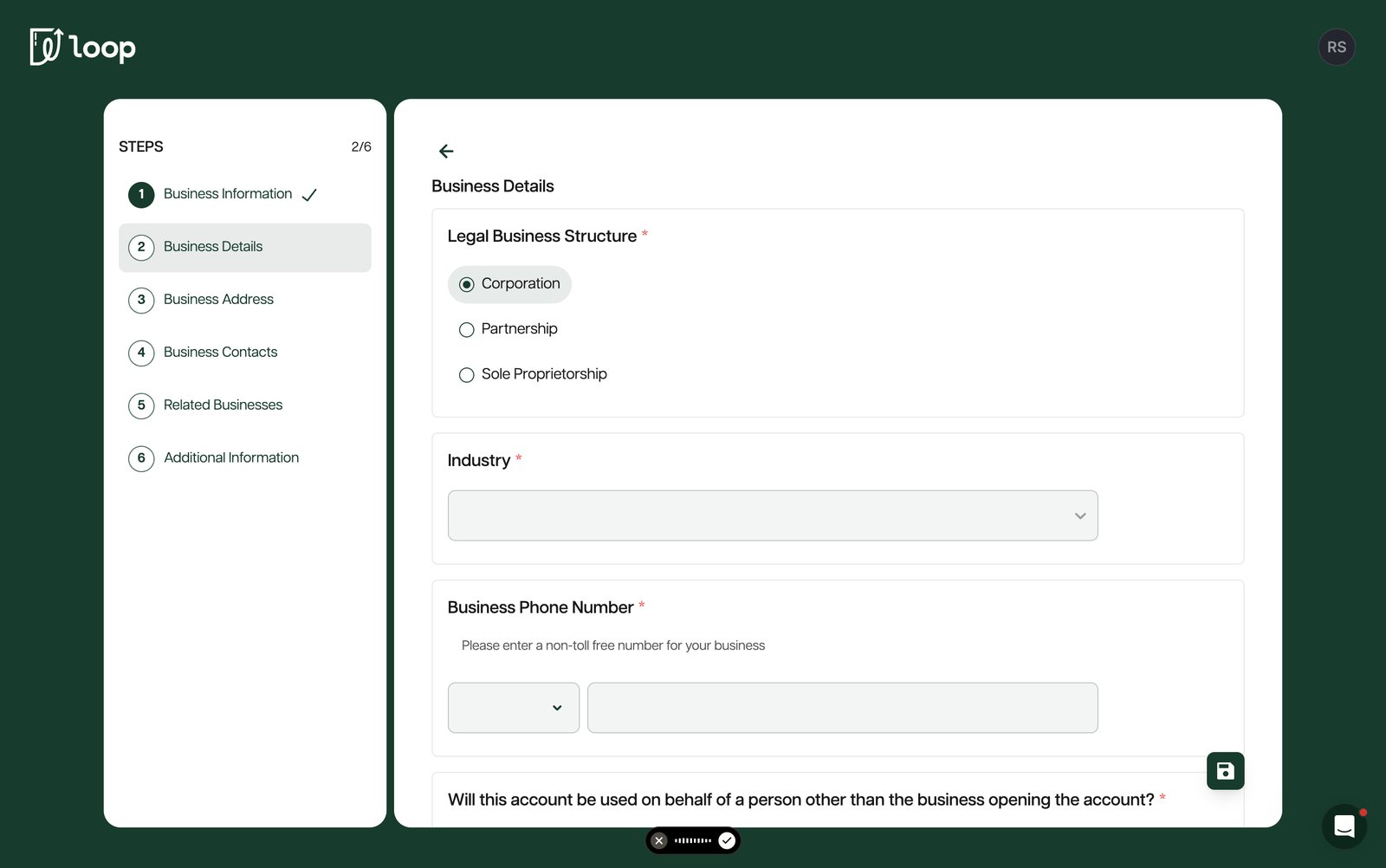
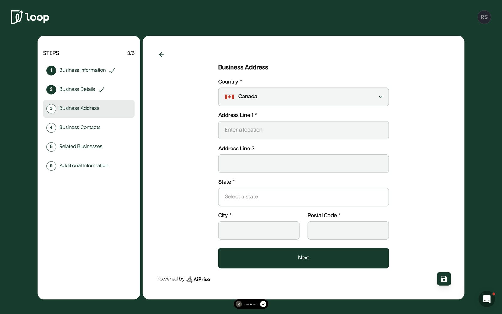
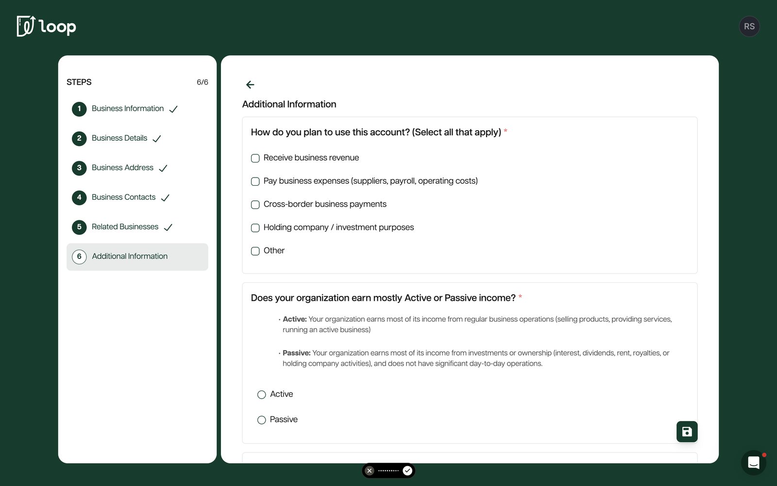
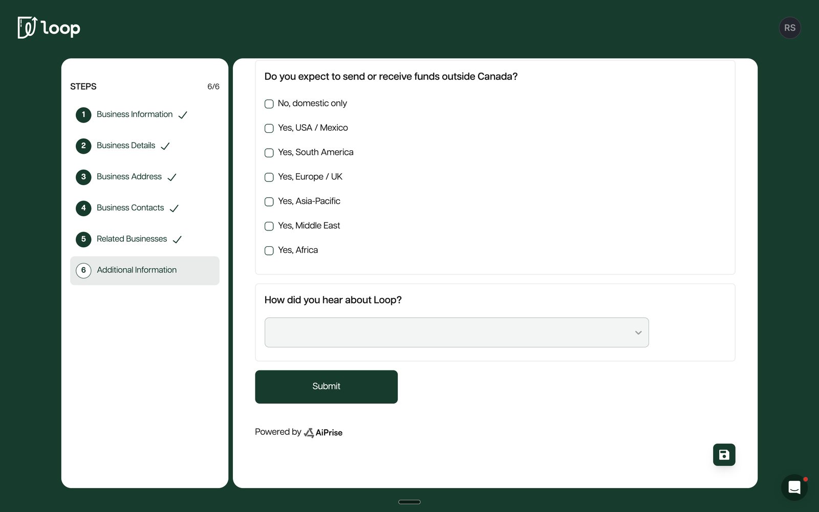
The old application started with an identity verification prompt from Loop's vendor, AiPrise, then walked every applicant through the same six steps, whether they were a sole proprietor or a corporation with a parent company.
Where the application lost clarity, and applicants' trust
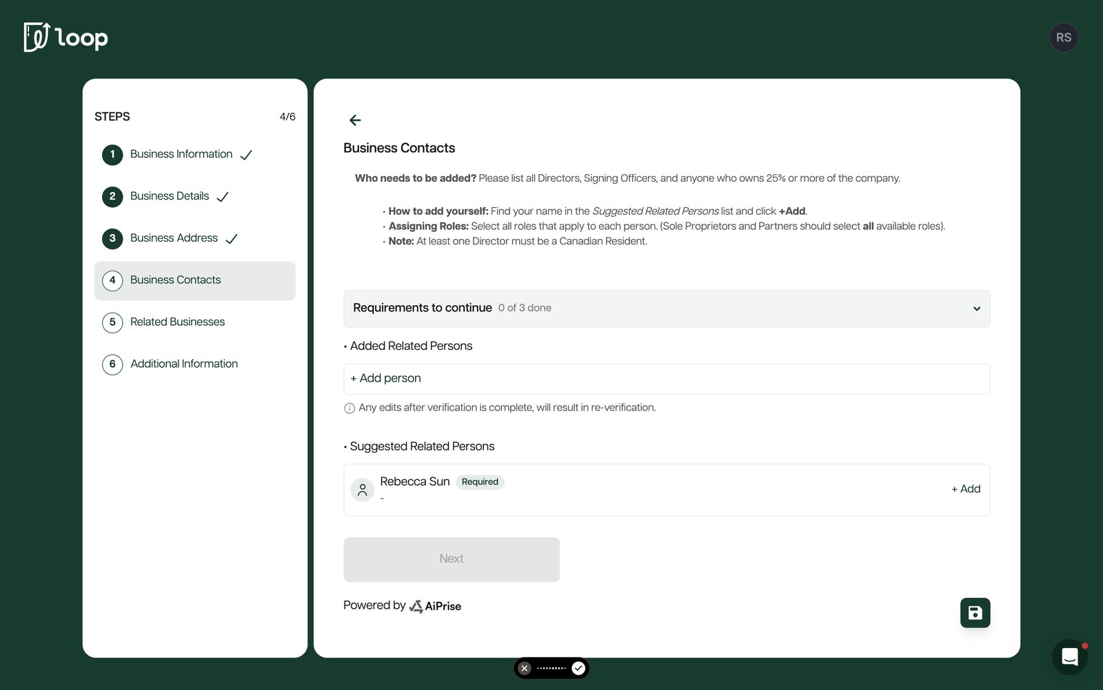
The old version was cluttered, leaned on long text instructions, and was out of date: some compliance questions had been added since it was built, and some it still asked were no longer collected. On top of that, the contacts section was the number one thing customers complained about. Four problems came up again and again.
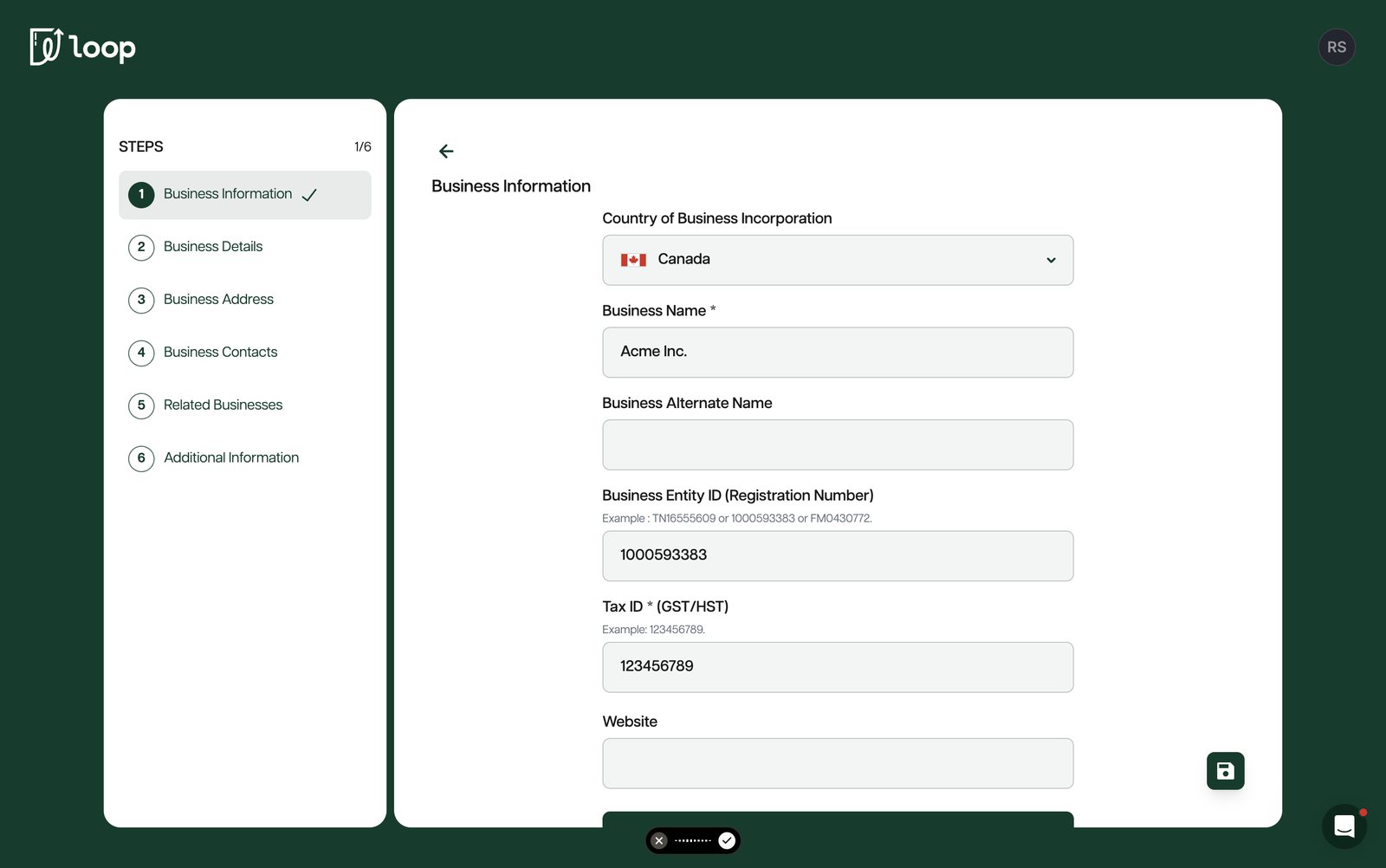
1. Nothing checked what people typed
 12
- 1Any business entity ID goes through, even one that is invalid or already in use. A typo or a bot with a random number reaches review.
- 2The tax ID only shows an example. There is no feedback if the format is wrong.
2. Every business got every question
1- 1A corporation and a sole proprietorship should lead to very different questions. Here the answer changes nothing, so a simple business still fills out everything.
3. The contacts page was a wall of text
12- 1Who to add, how to add yourself and which roles to pick are all packed into one block of instructions, so it is hard to tell what the page is asking.
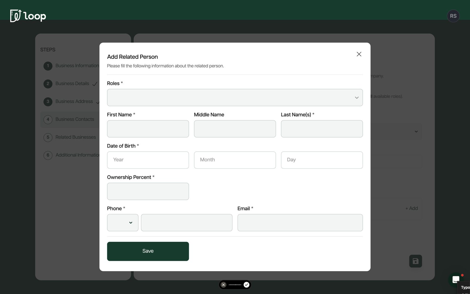
- 2Many applicants didn't realise they had to add themselves as a key contact. The mistakes showed up later as wrong or badly formatted entries.
4. No guardrails on the details that matter
12- 1Date of birth accepts any year, including 2026. Key people need to be at least 18.
- 2Ownership percent accepts anything, so owners can add up to 120%.
| Problem | What the applicant sees | What it costs Loop |
|---|---|---|
| No input validation | Moves on with a typo and finds out days later | Reviews stall on bad IDs; easier for bots to get through |
| One flow for all | Long form full of questions that don't apply | Early drop-off |
| Text-heavy contacts page | Unsure who to add, including themselves | Risk team corrects entries by hand |
| No guardrails | Can submit impossible answers | Slower approvals and more back and forth |
Applicants were finding out too late
Listening to the people closest to it
- Customer service said the biggest reason people dropped off was the amount of manual typing. Agents were often getting on calls to walk applicants through the form, which doesn't scale.
- Compliance owned the rules for who has to verify their identity and who needs to give an SIN or SSN. Most of it lived in long federal PDFs, and it changes with the type of business.
- Risk saw the other end: applications from businesses Loop could never serve, like restricted industries, pre-revenue companies or Quebec sole proprietorships, that only got turned down after the applicant had filled in everything.
- Clients. I sat in on three client calls. Loop's customer service team works closely with its clients, and they were happy to tell us what was confusing.
For a fintech that runs on trust, finding out at the very end that you were never eligible is about the worst experience you can give someone.
How other fintechs do it
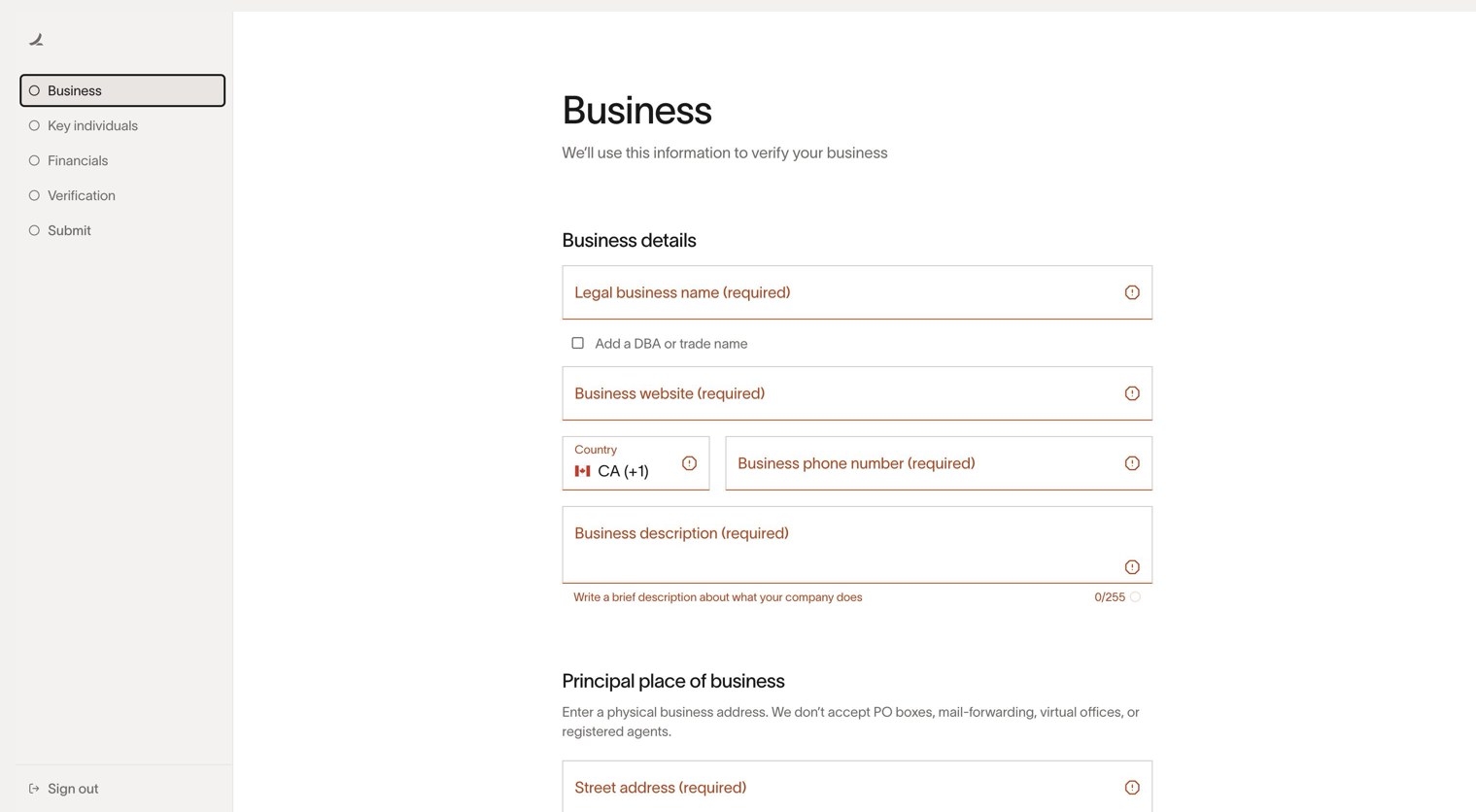
I signed up for real accounts at Mercury, Ramp (US and Canada), Float, Venn and Column, screenshotted every step and compared the patterns. Almost all of them screen for eligibility at the very start. Venn also checks the business number against the Canadian Business Registry while you type, and most of them show a step list with an estimated time up front. Loop had none of these.
 12
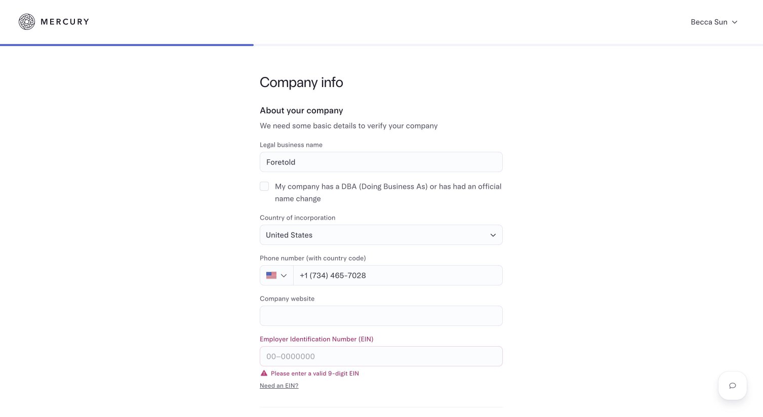
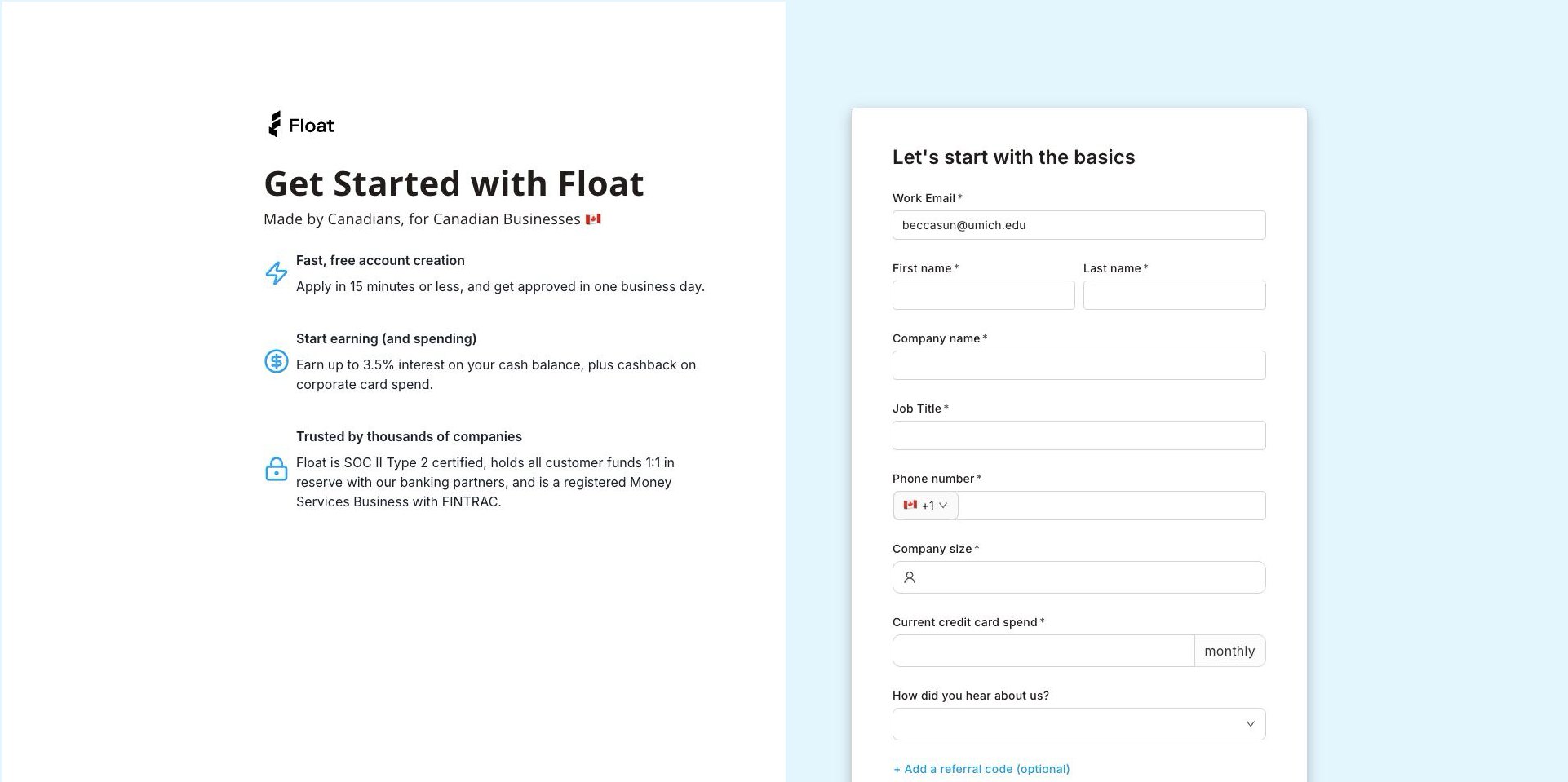
Errors you can't miss
- 1Every missing field is flagged in place, in one colour
- 2Helper text says what to write before you get it wrong
Where applicants dropped out
I pulled verification data from AiPrise to see where the funnel broke. Out of 364 sign-ups in the sample, fewer than half finished business verification, and only 18 reached the agreements step.
- Median wait for KYB review
- 3.3 days
- Screens designed for that wait
- 0
Telling businesses where they stand before they start
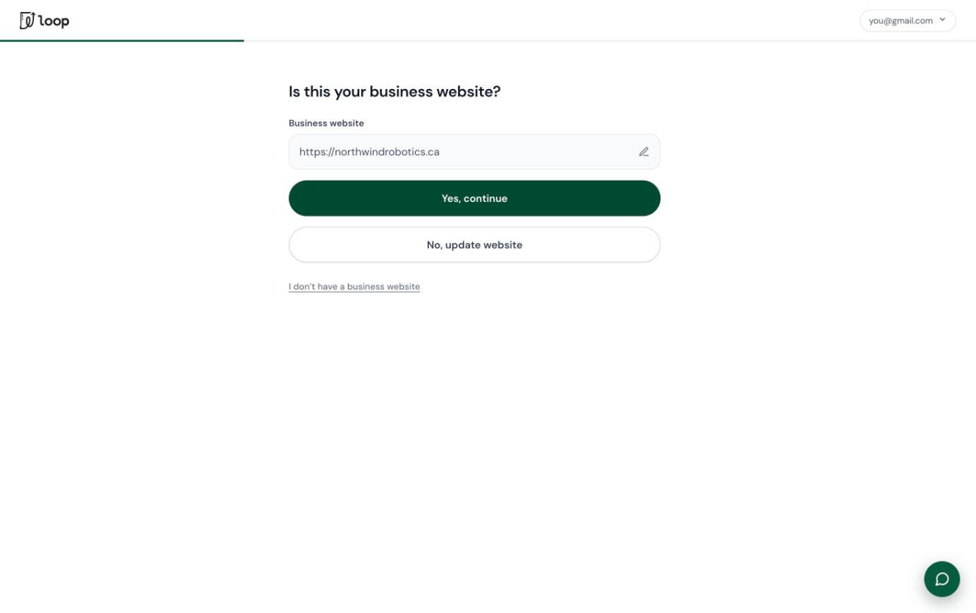
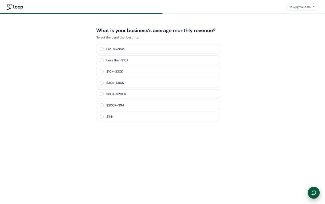
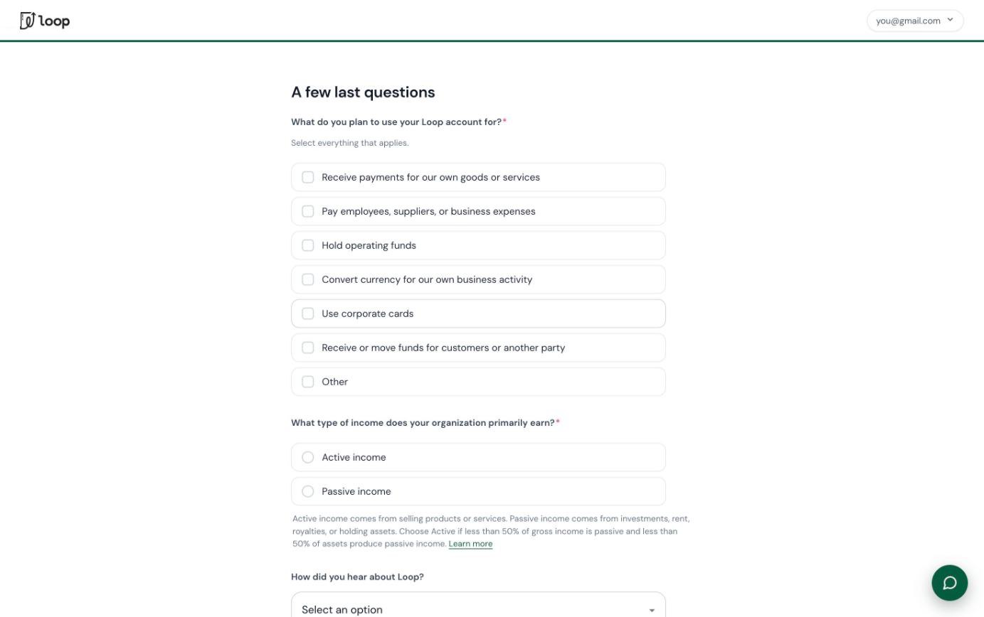
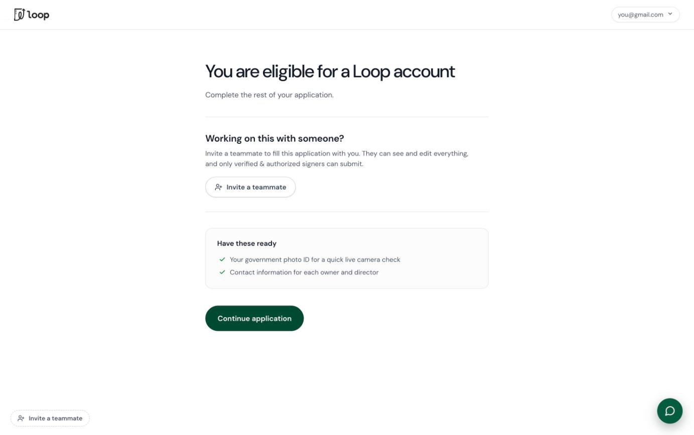
The team's first worry was that an eligibility check would make a long flow even longer: applicants would answer the eligibility questions and then still fill in all the business and ownership details after it. That worry shaped the rest of the design. Every answer in the check had to be reused later, so the check pays for itself.
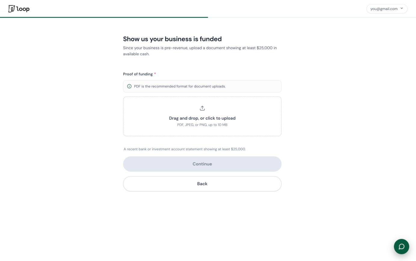
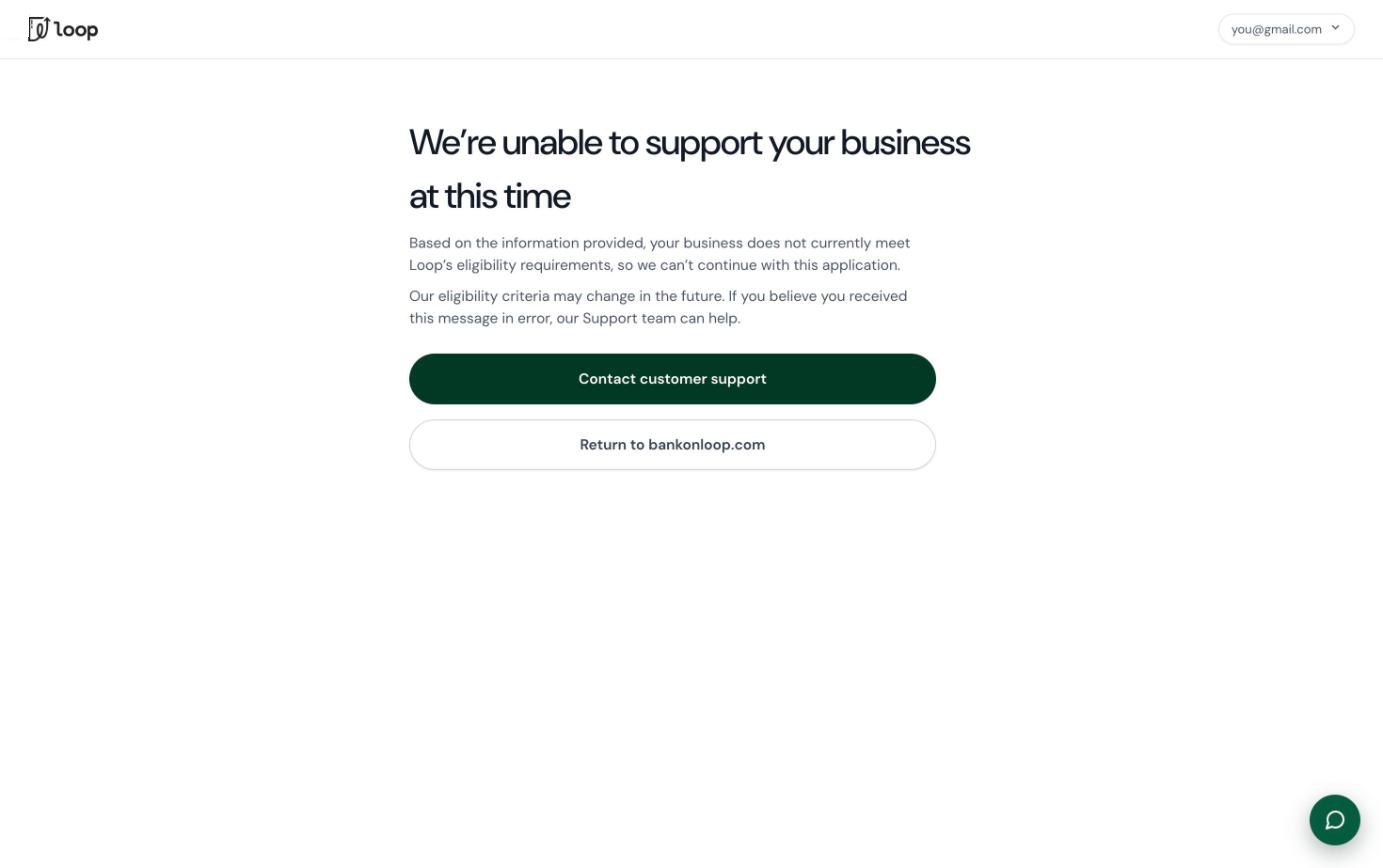
The final check isn't a single yes or no. Different answers lead to different outcomes:
Hard no
Restricted industries such as cannabis, gambling or crypto, and Quebec sole proprietorships, end at a clear exit with a way to contact support.
Soft no
Pre-revenue businesses aren't turned away. They're asked to show they're real and funded, for example a statement with at least $25,000 available.
Show us more
Some structures need an extra document: proof of operations for sole proprietorships and partnerships, an ownership chart when there's a related business.
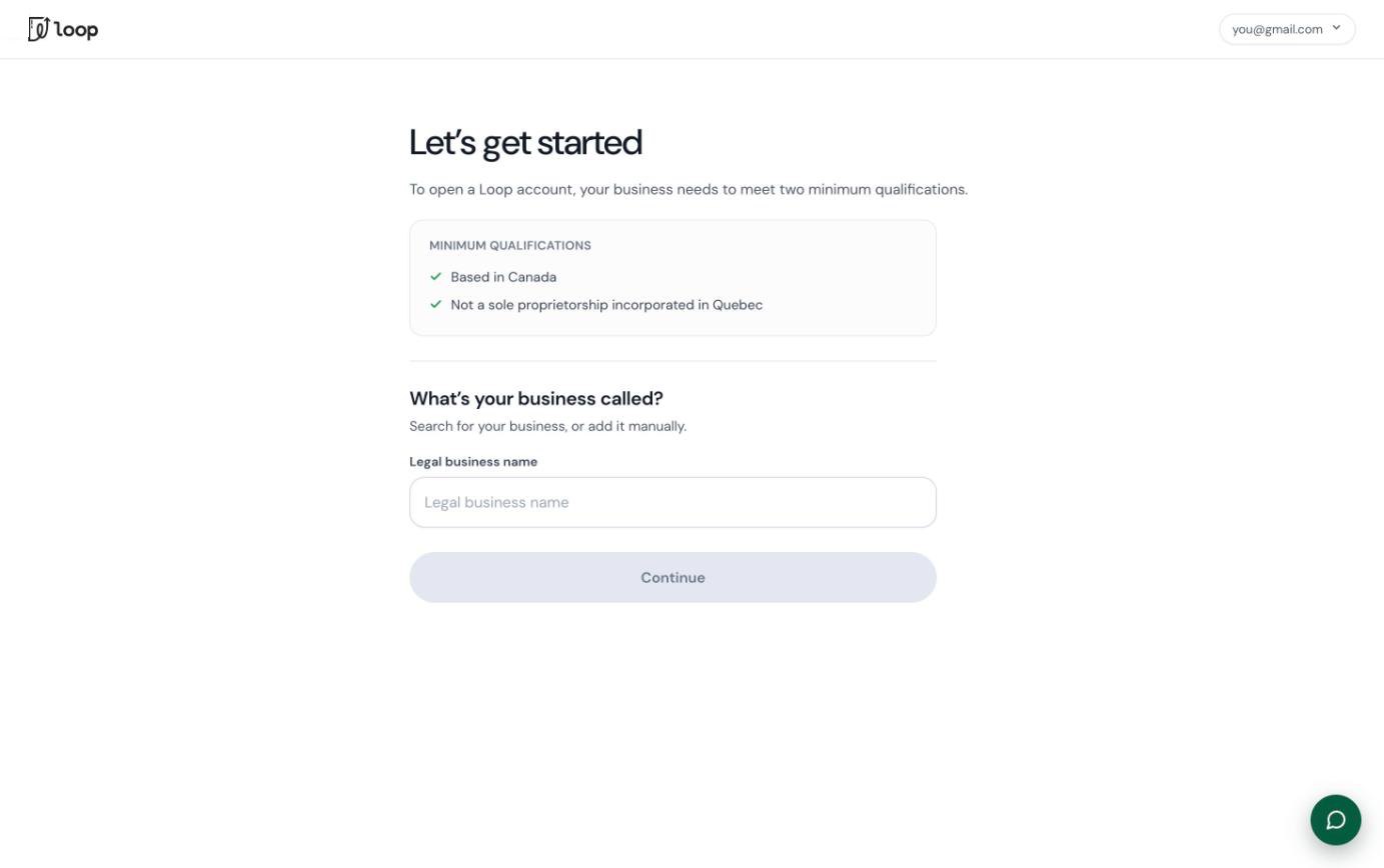
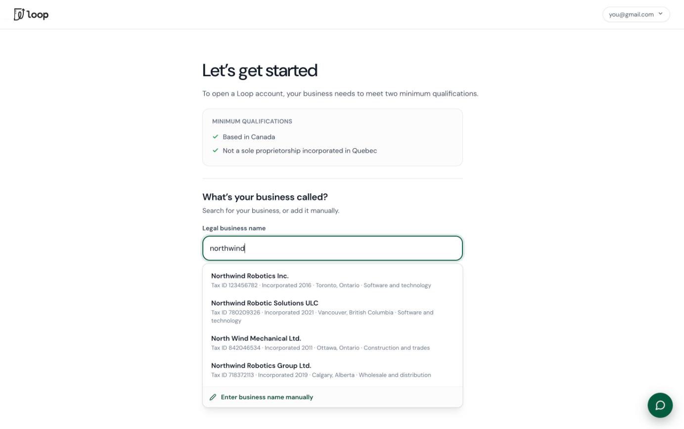
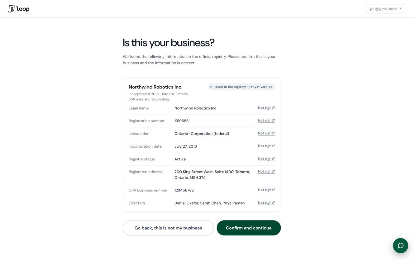
Letting the registry do the typing
Ask for the tax ID first, then do the work in the background
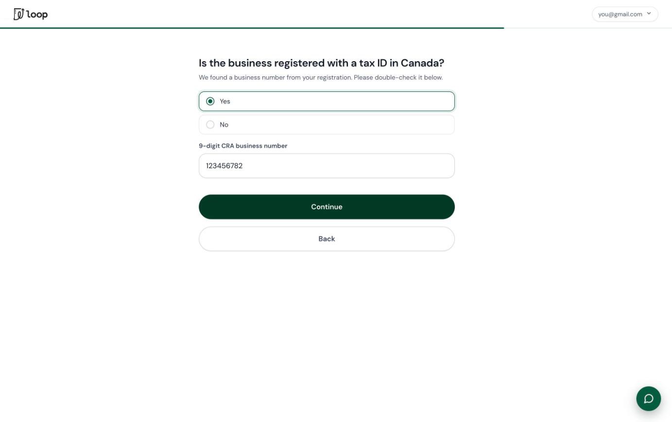
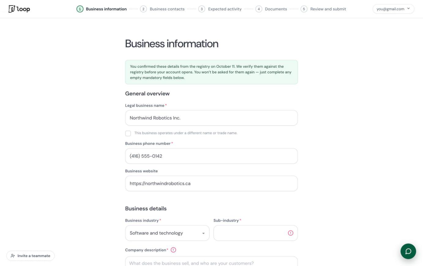
One of the first things we ask for is the business's name or tax ID. While the applicant answers the rest of the eligibility questions, the backend looks the business up in the registry and pulls what it can: industry, size, address, registered directors and authorized signers. By the time they reach the application, those fields are already filled in. They review what's there and fill the few gaps, which are marked.
This is what cut the time to apply by more than half, from 23 minutes to 9 in our testing. If a business isn't on the registry, for example because it's brand new, the flow falls back to a manual form.
 12
- 1The applicant already confirmed these details from the registry, so they're told they won't be asked again.
- 2Only the gaps the registry couldn't fill are marked as required.
Drawing ownership instead of describing it
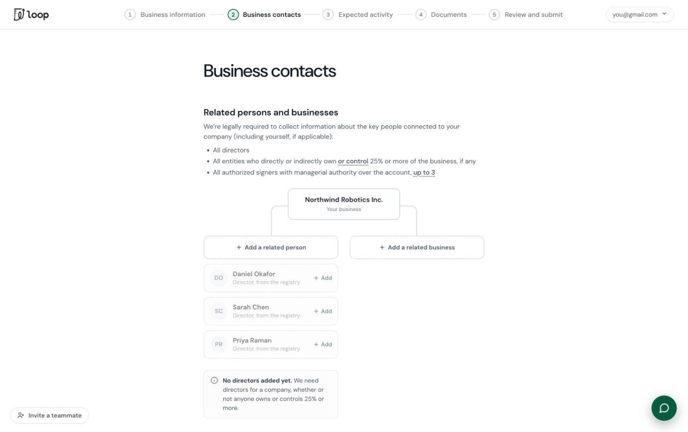
The contacts step was the hardest part to understand, because who counts as a key contact depends on the kind of business. Under Canadian rules there has to be at least one authorized signer submitting the application. A corporation must list its directors, a trust has trustees and beneficiaries, and a sole proprietorship has a single proprietor. That's hard to picture from a paragraph of instructions.
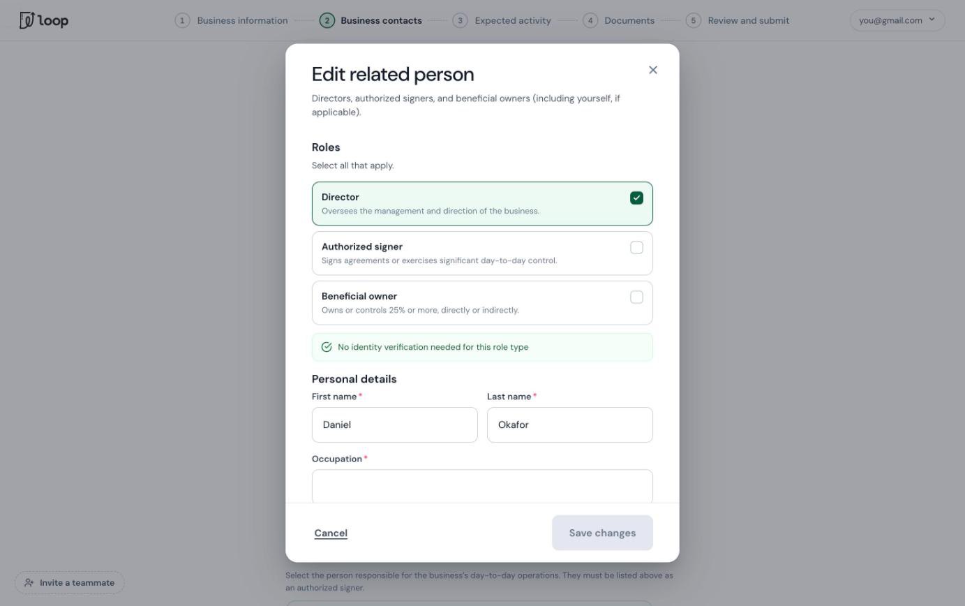
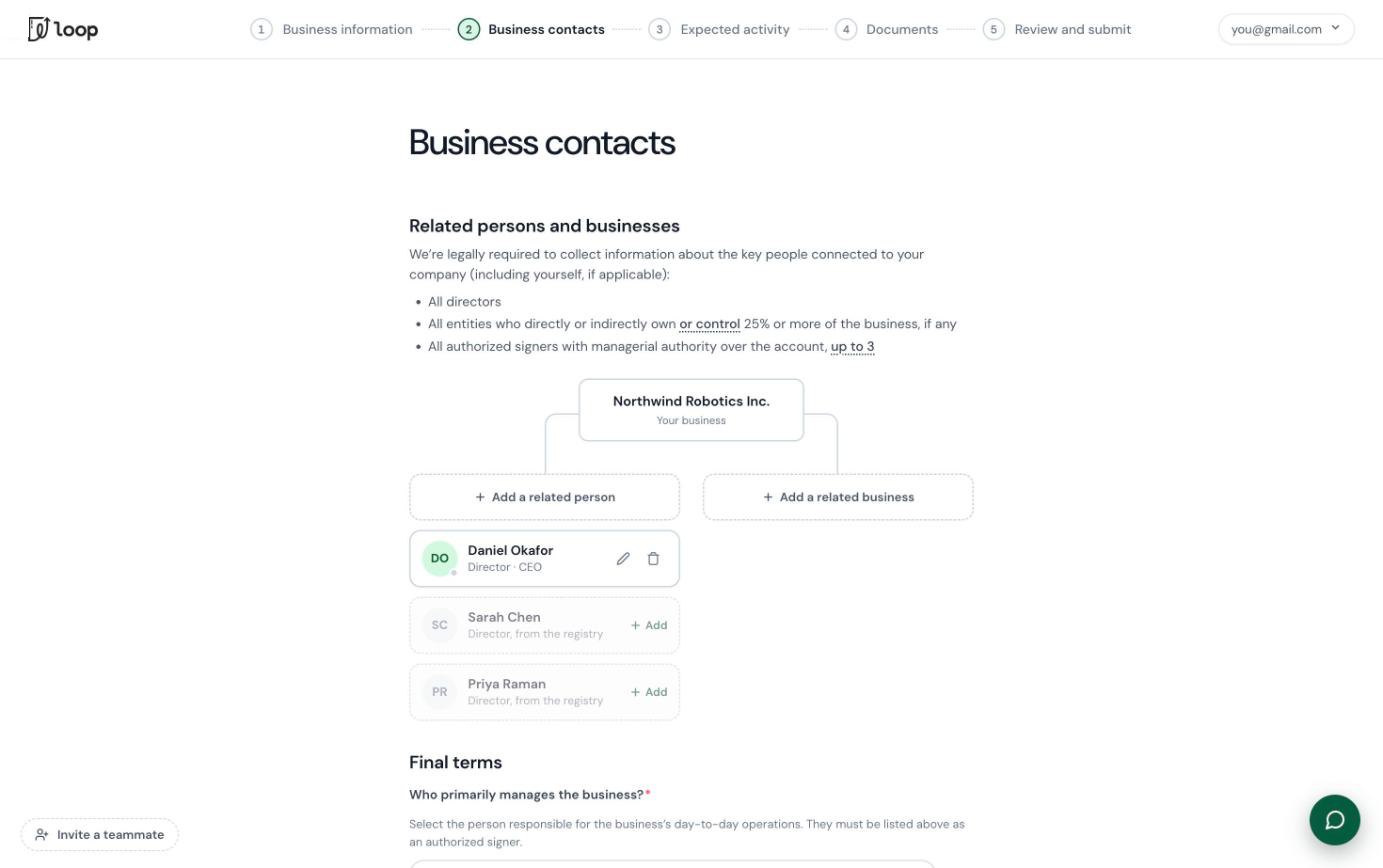
So the new page draws it. Your business sits at the top, people and related businesses branch off it, and directors found in the registry are already waiting to be added. The old flow kept people and related businesses on separate pages, which also meant there was no way to record a parent company that is itself an owner. Now a company can be an owner too.
 BeforeAfter
In testing, this was one of the parts people understood best.
Catching mistakes while people type
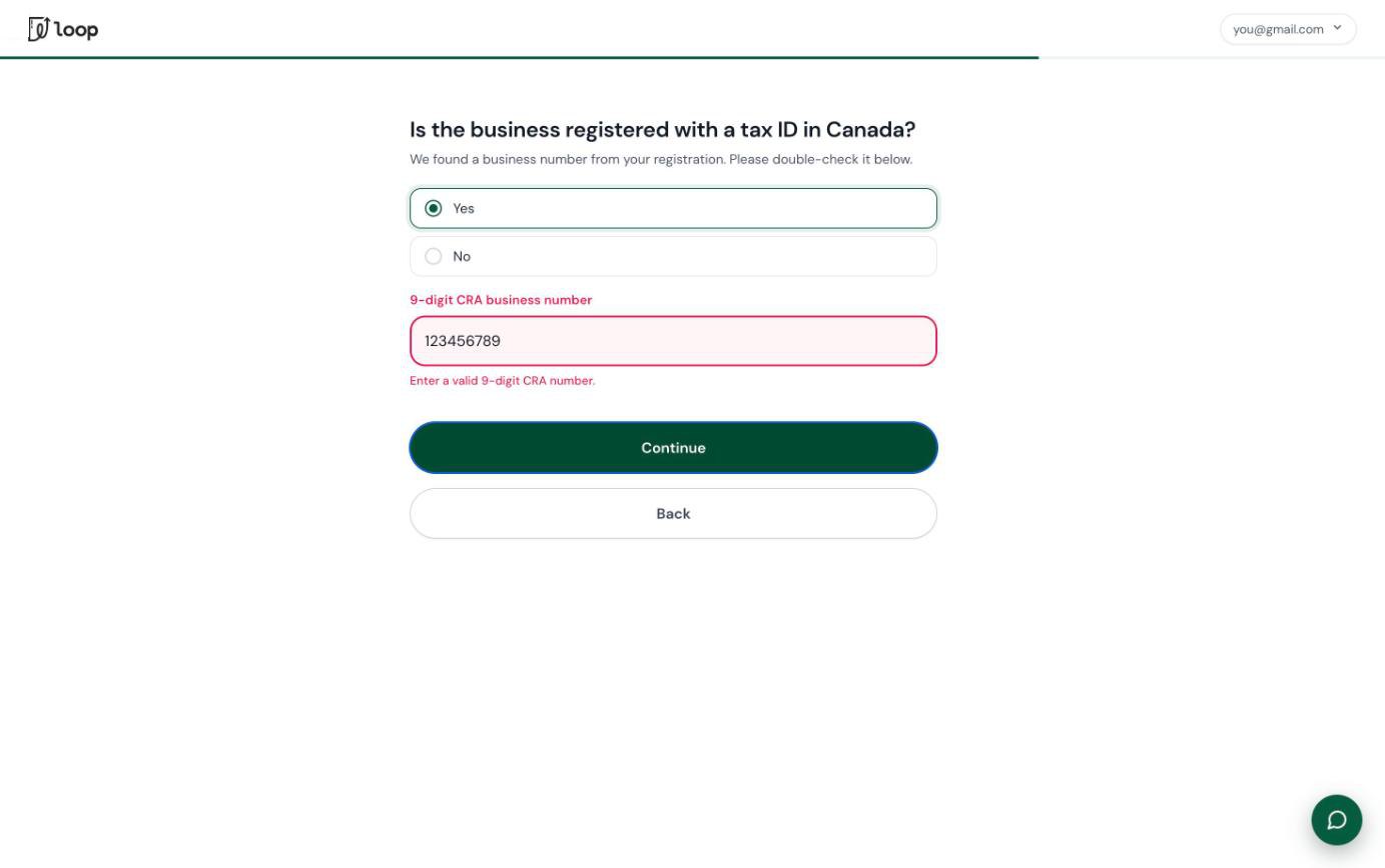
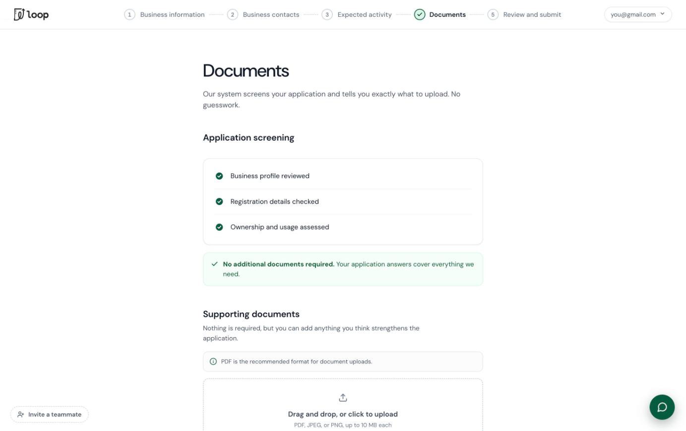
The CRA business number is checked as it's entered (nine digits and a valid checksum), birth dates have to make the person at least 18, and ownership shares are added up as you go. Documents are screened too: the page tells you exactly what to upload, and nothing at all if your answers already cover it.
Turning the review wait into a head start
A lot of applicants submitted without finishing their identity verification and never came back, so their applications could never be approved. Most of the fintechs I looked at also leave the review period blank.
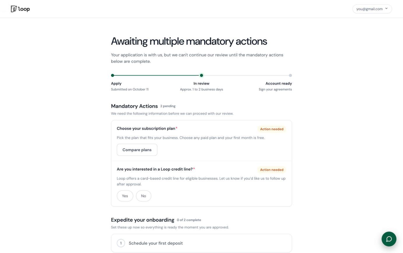
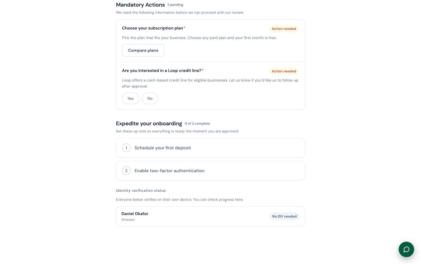
We designed it assuming every applicant is a good fit and will be approved. After submitting, they land in a waiting room that shows where the application is and what they can do in the meantime: the required steps, plus things like applying for a credit line or scheduling a first deposit to link their bank account. That way, the moment they're approved, they can go straight into the dashboard and start using the account.
Testing caught one problem here. People didn't realise the credit application stayed locked until they connected a bank account, so I added the connect button right inside the locked task and made the reason clearer.
Fifteen people trying to break it
The design was tested in three ways:
- I sat with people from the growth and risk teams as they went through the new flow for the first time.
- We ran a make-and-break session where around 15 people across the company tried to break the prototype or find flaws in it.
- Select clients tried it, alongside internal stakeholders. That's where the 23-to-9-minute number comes from.
The make-and-break session surfaced a lot of friction I hadn't accounted for, and the final design is better for it. I wrote everything up in a synthesis doc and worked through it in the next versions.
A prototype everyone could click through
Less than a week in, I started prototyping in HTML with Claude Code, built on the design system I was making at the same time. There was no PRD at first, so scope moved around. I kept strict versions of every prototype and deployed each one so anyone could click through the latest flow, and I took feedback at three stand-ups a week.
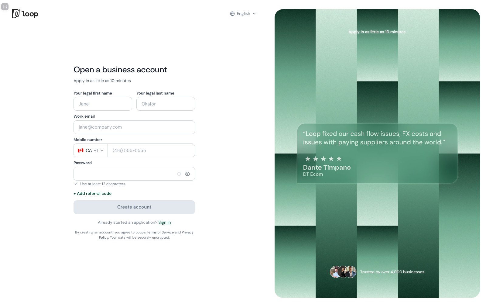
The prototype became the source of truth for both the interface and the flow in every meeting about the project, including one with the CEO and the head of engineering about fitting the flow to policy and regulation. Over 14 versions it went from a single screen to the whole connected flow. When a page was about 80% there, I brought it into Figma with the Figma MCP and finished the details by hand before handing it to engineering with annotations.
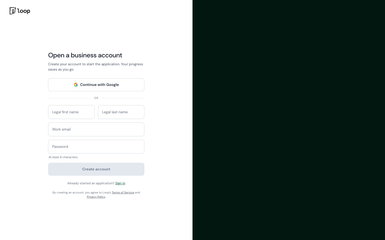 V1.0V3.7
Approved, and shipping in Q4
The design was approved for build and is set to ship to production in Q4 2026. There's no production data yet; the timing numbers come from testing with stakeholders and select clients.
What I'd carry into the next one
Most of the friction wasn't the compliance questions themselves. Loop has to collect what it collects. What I could change was the order, the feedback, the branching and what happens after you hit submit.
Design the wait, not just the form. A multi-day review is part of the product, and leaving it blank is where people were getting lost.
Leave a trail. Next time I'd document every change and every new decision as I go. Some choices, like a specific word or layout, aren't obvious, and whoever picks this up next deserves to know why they were made.
Test more, and measure closer. I'd run more usability tests on the final version, and set up tracking per question instead of per page. Today we can only see which page someone left on, not which question, which makes the smaller problems hard to find.